Everyone who’s ever sat in a tattoo chair has heard the warning: color doesn’t last. Reds fade to pink, yellows vanish into the skin, and anything bright ends up looking muddy within a year. It’s the fear that keeps a lot of people picking black and gray work even when they’d rather wear something bold.
Here’s the truth: plenty of color tattoos heal sharp and stay that way. We’ve pulled together 60 real examples photographed fresh and again 12 months later, and the results might surprise you. Along the way, you’ll see why certain pigments hold better than others, how placement affects fading, and what aftercare actually looks like when it works.
If you’re still in the planning stage, a quick read of tattoo healing stages will help you understand what’s happening under your skin during those first critical months. Otherwise, keep scrolling and see what a year of sun, showers, and daily life really does to a colorful tattoo when it’s done right.

Color Tattoos That Healed Without Fading: What Makes the Difference
Color tattoos get their bad reputation from the ones that failed. A tattoo done with cheap ink, rushed aftercare, or a spot that soaks in sun all summer can wash out fast, and that failure story travels. But two people can get the same design and see wildly different results a year later. The difference usually comes down to six factors: the quality and type of pigment, the artist’s saturation technique, your skin tone, placement on the body, sun exposure, and how you treated the tattoo during healing. Get most of those right and the color holds. Miss them and even the best design fades into a shadow of itself.
How Ink Pigments Behave in the Skin Over Time
Every tattoo color is made of pigment particles suspended in the dermis, the second layer of skin. Your immune system constantly tries to clear those particles out, and that slow tug-of-war is what causes fading.
Pigment size matters a lot here. Black ink uses large, dense particles that your white blood cells can’t easily swallow, so black tends to outlast everything else. Colors built on larger, heavier pigment molecules also sit tight for years. Lighter pigments work differently. White, yellow, and most pastels are made of smaller, finer particles that reflect light rather than absorb it, which also means UV light breaks them down faster. Think of the sun bleaching a curtain in a sunny window; the same thing happens to pale pigment, just much slower.
Skin adds another filter. The dermis sits under a layer of cells that’s slightly see-through, so every tattoo you see is viewed through a thin veil of skin tone. Deeper skin tones naturally mute pale colors, which is why artists who work well across all skin tones often adjust saturation rather than palette. For a fuller look at how this plays out across complexions, our guide to tattoos on all skin tones breaks it down.
The First Year: What Healing Really Does to Color
A fresh tattoo always looks incredible. That’s the surface layer of ink sitting right at the top of the skin, plus a bit of blood and plasma giving everything a rich, saturated glow. Then healing kicks in.
Here’s the rough timeline:
- Weeks 1 to 2: The tattoo is a wound. Plasma weeps, scabbing forms, and the color looks darkened or bruised.
- Weeks 2 to 4: The tattoo flakes and itches as dead skin sheds. Color often looks cloudy, waxy, or dull here. This is normal.
- Weeks 4 to 12: New skin layers grow over the ink and slowly settle. The tattoo looks flat and slightly grayish while this happens.
- Months 3 to 6: The top layers mature and thin out. True color finally shows through.
That cloudy middle phase fools a lot of people into thinking their tattoo faded, when it’s actually just healing. A tattoo’s real report card arrives at the 12 month mark, after a full cycle of seasons, sun, showers, and workouts. That’s when you can honestly say the color held or it didn’t, and it’s exactly what the gallery ahead measures.
60 Healed Color Tattoo Examples That Still Look Fresh
The gallery below organizes all 60 examples into four style groups, and each photo shows the tattoo at two points: fresh from the session and again one year later. You’ll notice a pattern pretty quickly. Some styles barely change at all, while others trade a little brightness for a soft, lived-in look that many people actually prefer. Pay attention to the color choices and placement in each group, because those two factors explain most of the differences you’ll see.
Bold and Bright: Traditional and Neo-Traditional Pieces
American traditional work dominated the “still looks fresh” category, and that’s no accident. Roughly 15 of the 60 examples fall into this group, including classic sailors’ jerry tattoos, panthers, swallows, daggers, and anchor designs on forearms, calves, and shoulders. The formula is simple: heavy black outlines, dense packing, and a limited palette of red, blue, green, and yellow.
One standout was a full-color eagle chest piece in deep reds and greens that looked nearly identical at the 12 month mark. A neo-traditional fox on a thigh held its saturated oranges and teals almost perfectly, thanks to thicker linework and heavier saturation than you’d find in a delicate design. Traditional work ages like a cast-iron pan; it was built to take a beating, and it does.
Soft and Subtle: Fine Line and Watercolor Tattoos
This group was the honest one. Of the 15 fine line and watercolor examples, about half held up well and half needed a touch-up within the year. Watercolor splashes in pinks and purples faded the most, since those pale pigments have no dark anchor holding them in place. The ones that survived best used a clever hybrid approach: a watercolor wash layered over a black or dark gray base, which gives the eye something solid to read even as the soft color lightens.
Fine line color work told a similar story. A small pastel rainbow on an inner arm softened noticeably, while a colored fine line bouquet on the upper arm kept its shape because the stems stayed dark. If you love this style, budget for a touch-up and choose placement away from sun.

Nature-Inspired: Floral, Botanical, and Animal Designs
Florals, butterflies, koi fish, and songbirds made up another 15 examples, and botanical pieces performed surprisingly well. Green and blue pigments were the MVPs here. Leafy monstera and eucalyptus tattoos on ribs and forearms kept their cool tones because blue-based pigments are among the most UV-stable inks available. A koi fish back piece in oranges and blues aged beautifully; the orange softened slightly, but the blue water swirls looked untouched.
Butterflies were mixed. Ones with black wing borders held their shape and color, while borderless pastel designs blurred a little at the edges. Roses, the most common flower in the group, kept their reds and greens reliably when the artists saturated heavily.
Statement Pieces: Color Realism, Mandalas, and Large-Scale Work
The final group covers the big commitments: color realism portraits, full-color mandalas, and sleeve segments. Large pieces age differently than small ones, mostly in your favor. Because the design is bigger, natural skin aging spreads the change over more area, so blurring shows up less. A full-color mandala on a forearm held its jewel tones in purples, teals, and golds almost perfectly, and a color realism koi-and-lotus half sleeve still read clearly at one year, though the fine highlights in the water needed minor refreshing.
Portraits were the riskiest. Skin-tone realism benefits from a slight over-saturation at the session, because the inevitable settling brings it back to a natural look. The successful examples all had one thing in common: artists who packed color in anticipation of the first year’s softening.
Which Tattoo Colors Fade the Fastest (and Which Hold Their Own)
Not all pigments age the same way. If you lined up ten colors on the same arm and photographed them a year later, you’d see a clear hierarchy, from the colors that barely moved to the ones that packed their bags early. Knowing that ranking before you sit down with your artist helps you design a tattoo that still looks good at the one-year mark, not just on day one.
The Fade Ranking, From Toughest to Most Fragile
Here’s how the major tattoo colors stack up when it comes to holding their saturation:
- Black is the undisputed champion. Its large, dense carbon particles resist both UV breakdown and your immune system’s cleanup efforts.
- Dark blue and navy come next. Blue-based pigments are chemically stable and absorb light rather than reflecting it, so they weather sun well.
- Red and purple sit in the middle. Modern reds hold surprisingly well when saturated heavily, though cheaper red pigments can cause reactions that speed up fading. Purples are similar, staying true unless exposed to constant sun.
- Green and orange hold reasonably well but soften earlier than the colors above them. Orange, in particular, tends to drift toward a duller, browner version of itself within a couple of years.
- Yellow, white, and pastels fade fastest. These fine, light-reflecting pigments break down under UV exposure and often sink into the skin tone itself. Pale yellow on light skin can almost disappear.
That’s why traditional tattooers built their palette around black, red, blue, and green. Those colors survive. A yellow sunrise or a pink watercolor splash needs a dark anchor nearby to keep reading as a shape over the years.
Why Light Colors Lose the Fight
The physics is simple. Dark pigments absorb UV light and convert it to heat, which leaves the pigment mostly intact. Light pigments reflect light, and that reflected energy slowly shatters the pigment particles into pieces small enough for your white blood cells to carry away. Sunscreen is your best defense here, but it only slows the process; it can’t stop it.
Skin tone plays a role too. Pale colors sit behind a layer of skin that already lightens everything underneath, so a pastel that pops on very fair skin may barely register on a deeper complexion. Good artists compensate by bumping saturation or swapping in a stronger midtone.
What to Expect If You Love Light Colors
You can absolutely get yellow, white, or pastel work, just walk in with realistic expectations. Plan on a touch-up within the first two years, choose placement that rarely sees sun (ribs, upper thigh, upper arm), and pair pale shades with black or dark linework so the design keeps its outline even as the fill softens. Many people end up preferring the slightly muted look anyway; it reads as aged rather than faded, like a favorite band tee that fits better than it did new.
The one-year photos in the gallery ahead make this ranking visible. Watch the blacks and blues stay put while the yellows whisper off, and you’ll never look at a color palette the same way again.
How Skin Tone and Placement Shape Color Tattoo Results
Two tattoos can use identical ink and identical technique, yet look completely different a year later. The variables that sit outside the artist’s machine matter just as much as the ones in it: your skin tone filters every pigment before your eye sees it, and the body spot you choose decides how much sun, friction, and washing that color endures daily. Understanding both before your appointment means fewer surprises when you’re looking at healed photos months down the line.
Getting Color Right on Every Skin Tone
Melanin sits between the ink and your eye, and it works like a tinted filter over a photograph. The more pigment in your skin, the more it mutes whatever lives underneath, especially colors that are already pale. That’s why experienced artists don’t use a single universal palette. On medium and deep skin tones, they often raise saturation, strengthen contrast, and lean on bold midtones so the design keeps its punch after healing.
Some colors earn their reputation across every complexion. Red, royal blue, emerald green, and purple tend to read clearly on deeper skin because their pigments are dense and saturated. White and pastel yellow are the riskiest picks, since they can sink into the skin tone and vanish rather than fade visibly. Artists who work often with melanin-rich skin also tend to under-promise on pastels, and that honesty is a good sign; if a tattooer guarantees a soft lavender will look identical on your skin, be skeptical.
The goal is contrast, not saturation alone. A tattoo with strong value differences between its elements stays legible as it softens, while a low-contrast design can blur into an indistinct shape. If you want a deeper walkthrough, our guide to tattoos on every skin tone covers palette choices in detail.
Best and Worst Body Spots for Long-Lasting Color
Placement decides how much abuse your tattoo takes. Three things drive fading: sunlight, friction, and frequent washing. Sun-exposed areas like forearms, shoulders, and hands absorb the most UV, which is why they lighten first. High-friction spots, including fingers, palms, feet, and anywhere clothing or straps rub constantly, shed pigment faster because the skin there turns over more aggressively.
The stable zones tell a different story. The upper arm, thigh, calf, back, and ribs see little direct sun in most wardrobes and almost no rubbing, so color holds far longer there. Our own one-year gallery backs this up: the pieces that looked untouched at 12 months overwhelmingly sat on those sheltered spots.
If your heart is set on a hand or finger tattoo, go bold. Thick lines and dark, saturated color survive what thin pastel work cannot. For more planning help, see our breakdown of the most painful tattoo placement spots, since durability and discomfort often overlap.
Aftercare Habits That Keep Color Tattoos Vibrant for Years
Every one of the 60 healed tattoos in the gallery above shares something beyond good technique. The owners treated aftercare as part of the tattoo itself, not an afterthought. Color ink is less forgiving than black, so the first month and the years that follow decide whether that saturated rose stays a rose or becomes a blur. The habits below are simple, but they compound. Do them consistently and your one-year photo will look a lot like your day-one photo.
The Healing Routine That Protects Fresh Color
The first 30 days set the ceiling for how good your tattoo will ever look. Your artist will give you specific instructions, and those override anything you read online, including here. Still, the core routine looks similar across shops.
Wash the tattoo two to three times a day with fragrance-free antibacterial soap and lukewarm water, then pat dry with a clean paper towel. Let it air dry for a few minutes before applying a thin layer of recommended ointment or unscented lotion. Thin means thin; the skin should look matte, not greasy, because trapped moisture suffocates healing skin and can pull color out.
Two habits cause most color loss in the first month. The first is soaking: no swimming, baths, hot tubs, or long showers while the tattoo heals. The second is picking. Flaking skin that tears away early takes pigment with it, leaving pale patches that only a touch-up can fix. Wear loose clothing over the area and resist the itch, no matter how bad it gets around week two.
Sunscreen: The Single Biggest Factor in Preventing Fade
Once your tattoo is fully healed, usually around week four or later, UV light becomes the main threat. Sunlight breaks down pigment particles, and light colors like yellow, white, and pastels suffer first. A tattoo that never sees sun can hold color for a decade; the same tattoo on a forearm without protection can noticeably soften within a single summer.
The fix is cheap and boring. Apply SPF 30 to 50 broad-spectrum sunscreen whenever the tattoo will be exposed, even on cloudy days, even in winter. Reapply every two hours outdoors, and again after swimming or heavy sweating, since sunscreen rubs off faster than most people realize. For small pieces, a stick sunscreen makes reapplication quick and clean. Make it part of your morning routine the way you’d treat any exposed skin, and treat a fresh touch-up the same way once it heals.
Touch-Ups and Long-Term Maintenance
Even perfect care can’t stop all settling, and that’s normal. A touch-up makes sense when lines soften, a pale color drops out, or a spot healed unevenly. Most artists include a free touch-up within the first six to twelve months, so use it if your healed tattoo needs it.
After that, expect light colors like yellow, orange, and pastels to need refreshing every three to five years, while dark, saturated work often goes much longer. Touch-up sessions typically cost between $50 and $150 for small areas, or an hourly rate if the piece is large. Always return to the original artist when possible; they know exactly how the piece was saturated and can match the palette without guesswork. Keep your healed photos too, because comparing year to year tells you when it’s actually time to book.
How to Choose an Artist Who Delivers Healed Tattoos That Don’t Fade
Every portfolio looks impressive on Instagram, because fresh tattoos photograph beautifully no matter who holds the machine. The real test is what that work looks like 12 months later, and that’s exactly what you should be hunting for before you book.
Ask for Healed Photos, Not Fresh Ones
Directly request healed work, ideally photographed one year or more after the session. A confident artist keeps these on hand and will show them without hesitation. If the response is “my fresh work speaks for itself,” treat that as an answer. Healed photos reveal everything fresh ones hide: blown-out pastels, muddy shading, lines that thickened as the skin settled. Compare the paired images side by side and look at how the color held, not just whether the design survived.
Read Reviews That Mention Healing
Scan reviews for the word “healed.” Clients who come back months later to praise their color are giving you the most honest data available. Look for patterns too. One complaint about fading might be bad aftercare; three reviews noting washed-out yellows point to the artist’s technique or ink choices.
Questions to Ask During the Consult
A good consult is an interview that goes both ways. Bring these questions:
- Which ink brands do you use, and why? Established names like Eternal, World Famous, and Intenze signal the artist invests in pigment quality.
- How do you adjust color for my skin tone? A strong answer mentions saturation levels and contrast, not a one-size-fits-all palette.
- How will these colors look in five years? Honest artists flag fragile shades like yellow and white and suggest dark anchors.
- What’s your touch-up policy? Free touch-ups within the first year show they stand behind their healed results.
Watch how the artist reacts. Defensiveness is a red flag; plain, specific answers are a green one. An artist who talks openly about fading risk is an artist who has thought about longevity, and that’s the person you want holding the machine when your color has to last.
Conclusion
Those 60 healed tattoos make the case better than any warning ever could: color lasts when the four fundamentals line up. Pigment choice, placement, artist skill, and sun protection decide whether your piece still looks bold at the 12 month mark. Miss one and fading speeds up; get all four and your one-year photo will barely differ from day one.
Use the gallery above as proof and as a planning tool. Notice how the traditional pieces with dark anchors held strongest, how sheltered spots like the upper arm and thigh outlasted sun-exposed ones, and how honest artists flagged fragile shades before the needle ever touched skin. Those patterns are your blueprint, and our guide to tattoo aftercare mistakes covers the habits that undo good work.
If you have a color tattoo that’s survived a year or more, share your before-and-after photos in the comments. Real healed examples from real people are the best evidence this article could ever add.
Save the pin for later
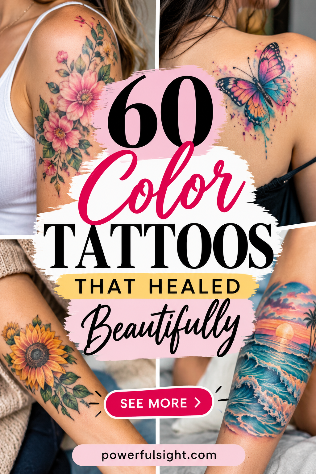

- 60 Color Tattoos That Healed Beautifully - 25/09/2026
- 40 Most Painful Tattoo Spots - 24/09/2026
- 20 Tattoo Aftercare Mistakes That Ruin Fresh Ink - 23/09/2026

