Watercolor tattoos bring a soft, painterly quality to body art through blended colors, loose splashes, and fluid movement. Instead of relying on heavy black outlines, these designs can resemble a brushstroke captured on skin, creating an expressive look that feels personal and artistic.
This collection features 25 beautiful watercolor tattoo ideas, including delicate flowers, dreamy animals, celestial details, and bold abstract designs. You’ll also find inspiration for smaller pieces and placements such as watercolor ankle tattoo designs, but keep in mind that soft pigments can fade and lose definition sooner than heavy traditional linework.
The right design, placement, artist, and aftercare all affect how your tattoo looks over time, so consider those choices before booking. Start with these creative ideas, then narrow down the style that best suits you.
What Makes Watercolor Tattoos Look Different
Watercolor tattoos imitate the movement and softness of paint on paper. Instead of filling every shape with one solid color, the artist builds the design with transparent washes, blended tones, open skin, and loose marks. The result looks lighter and more fluid than traditional tattoo work.
Color washes create a painted effect
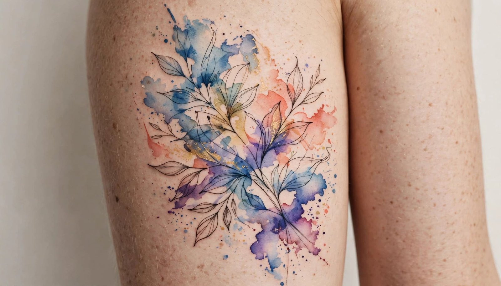
A watercolor tattoo often begins with thin layers of pigment. These color washes overlap gently, allowing shades to shift across a flower petal, animal figure, or abstract shape. Blue may fade into violet, while pink can melt into orange without a hard border between them.
Gradients are another defining feature. Traditional tattoos often use solid color blocks to create clear separation, but watercolor designs rely on gradual transitions. This approach gives the image a softer surface, similar to wet paint spreading across textured paper.
Artists may also add splatter effects, brush-like streaks, or small pigment marks around the main subject. These details create movement and make the tattoo feel less contained. A butterfly might have scattered color around its wings, while a landscape could include loose blue and green strokes beyond its main outline.
Soft edges and negative space keep designs airy
Traditional tattoo styles usually depend on bold outlines, strong shadows, and solid areas of ink for structure. Watercolor tattoos take a lighter approach. Their edges may fade into the skin, break into small dots, or disappear completely in certain areas.
Negative space plays an important role in that effect. Instead of covering every section with pigment, the artist leaves parts of the skin open. This creates highlights and gives the design room to breathe. The uncovered skin can function like the white space on a sheet of watercolor paper.
Still, an airy design needs visual balance. If every edge is pale and undefined, the subject may become difficult to read. Many successful watercolor tattoos combine soft outer edges with a clearer center, allowing the eye to recognize the main shape quickly.
Subtle linework helps the image stay readable
Watercolor tattoos aren’t always free of outlines. Many include delicate linework, a darker central shape, or a few anchor points beneath the color. These details provide a framework while allowing the washes and splatters to remain expressive.
For example, a watercolor wolf may use fine black lines around the eyes and nose, then surround the face with gray, blue, and purple brush effects. A floral design might keep thin contours around the stem while letting the petals fade at their edges. That contrast gives the tattoo both softness and definition.
Size and contrast also affect how the style looks over time. Larger designs have more room for layered pigment, open spacing, and readable details. Stronger contrast and saturated colors usually retain more visual impact than tiny designs filled with very pale washes. If you want a design that depends on several color transitions, review these tattoo placement and sizing ideas before settling on the final concept.
The most successful watercolor tattoos balance freedom with structure. Loose color creates the artistic quality, while selective linework, dark accents, and thoughtful spacing keep the image recognizable.
25 Beautiful Watercolor Tattoo Ideas for Every Style
Watercolor tattoo ideas work across delicate, realistic, celestial, and abstract styles. The best choice depends on how much detail you want, how much space you have, and whether you prefer soft color, defined linework, or both.
Soft Floral and Nature-Inspired Designs
A watercolor rose uses pale pink, coral, or red washes that fade gently across each petal. It can suggest love, remembrance, or personal growth while staying elegant on the forearm, shoulder, or upper arm. A lotus or peony cluster creates a fuller floral design, with layered petals and green leaves adding depth. Choose a cluster for the thigh, back, or hip when you want more room.
A cherry blossom branch suits a light, feminine tattoo. Pink pigment can diffuse beyond the petals, creating the feeling of petals moving in the wind. A sunflower looks striking with golden wash edges and a darker center, especially on the upper arm or calf. For a smaller idea, try a dragonfly with translucent wings, using blue, teal, and violet gradients to suggest delicate movement.
A feather with trailing paint strokes can symbolize freedom, memory, or a fresh start. Its narrow shape fits the wrist, ribs, ankle, or collarbone. These designs stay visually clean when the artist allows the color to fade rather than adding too many scattered marks.
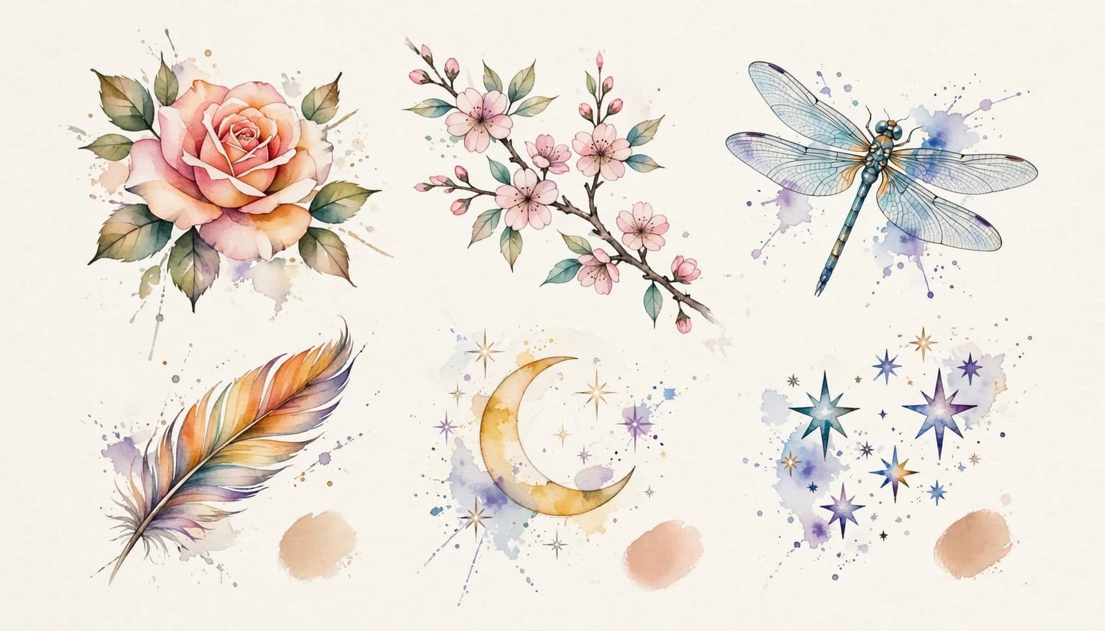
You can personalize any floral tattoo through your birth flower, favorite colors, a meaningful date, or tiny initials. Keep personal details small and leave enough open skin around the main artwork.
Animals, Birds, and Colorful Movement
A butterfly with pastel wing gradients is a popular delicate tattoo because its shape remains recognizable even with minimal black linework. Soft pink, lavender, blue, and yellow can suggest transformation without making the design feel heavy. A hummingbird with a trailing color wash adds more motion, with turquoise, green, and magenta flowing behind the wings.
For a bolder concept, choose a koi fish with blue and orange ink pools. Its curved body works well along the forearm, thigh, or side, where the color can follow the body’s movement. A bird silhouette with a multicolor wash background offers a simpler alternative and can fit the wrist, hip, or ankle.
A wolf or lion portrait with color-bleed edges needs more space for eyes, fur texture, and facial proportions. The upper arm, thigh, chest, or back gives the artist room to preserve those details. In contrast, silhouettes and simplified animals can work at a smaller scale.
The snake wrapped around watercolor florals creates a longer composition with a clear sense of movement. Curved placement along the thigh, ribs, or back lets the snake guide the eye through the flowers. For larger nature compositions, browse these watercolor full-back tattoo designs for placement inspiration.
Sky, Water, and Dreamlike Scenes
A moon and stars with a nebula-style sky combines a clear celestial shape with soft purple, blue, and pink clouds. A mountain landscape with a sunrise wash uses orange, yellow, and violet to create distance behind the peaks. Both designs can fit the upper arm, shoulder, or calf, although wider layouts give the landscape more atmosphere.
An ocean wave with teal and indigo gradients suits anyone who wants a fluid design with natural movement. The shoulder, thigh, and forearm provide enough length for the wave to curl naturally. Angel wings with blue and purple fades need more space, especially when the feathers include fine linework. The back, ribs, or shoulder blades allow both wings to spread without crowding.
A galaxy nebula composition can stand alone as an abstract field of stars and blended color, while a jellyfish with floating color trails adds a recognizable subject. Use blue, teal, violet, and pink washes to make the jellyfish appear suspended underwater. Wider placements such as the back, thigh, ribs, and calf give these scenes room to develop.
Abstract, Geometric, and Personal Concepts
A mandala with watercolor infill and fine black anchors balances precise structure with loose color. A geometric shape with a color burst center follows the same contrast, using crisp edges around a vivid pink, orange, or blue core. The lotus and dotwork hybrid adds a spiritual or meditative quality while keeping the petals clearly defined.
For a personal design, try a heart silhouette with multicolor splatter, a quote tattoo with a watercolor cloud background, or an abstract rainbow pigment ribbon. Keep lettering large enough to read because soft color cannot replace clear letterforms. The quote may work on the ribs or forearm, while the ribbon can follow the collarbone, shoulder, or thigh.
Finally, an abstract color splash forearm band turns loose pigment into a wearable strip of color. Structured shapes and lettering need crisp lines, but splashes and color fields create the painted effect. A forearm band needs enough spacing to avoid becoming a solid blur as the ink ages.
How to Choose the Right Watercolor Tattoo Design and Placement
Choosing a watercolor tattoo involves more than picking a beautiful reference image. Your concept should match its intended meaning, preferred colors, available space, daily routine, and comfort with future fading. A design that looks delicate and balanced on paper may need different proportions once it sits on your skin.
Match the Design to Your Size, Color, and Lifestyle
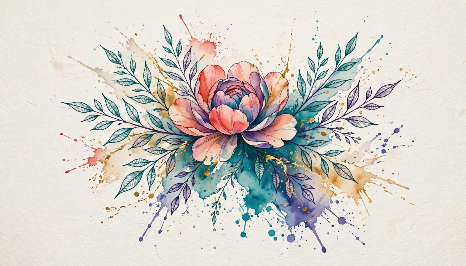
Start with the idea you want to carry, whether it’s a birth flower, a meaningful animal, a favorite place, or an abstract blend of colors. Then consider how much detail that idea needs. A detailed wolf, landscape, or lettering piece requires more room than a simple flower, heart, or color splash. When a complex design is reduced too far, fine lines and small color transitions can merge as the tattoo ages.
Very small watercolor tattoos usually work best with one clear subject and limited detail. A tiny flower can remain readable with soft petals and a simple stem, while a miniature landscape may lose its depth. If you want lettering, keep the words large enough to read and add subtle linework instead of relying on pale color alone.
Your color palette also affects visibility. Bright, saturated shades such as deep blue, violet, coral, and red usually create more presence than very pale pinks, yellows, or lavenders. Contrast gives the design visual anchors, so ask whether a darker center, fine outline, or stronger shadow could help the image remain recognizable after the soft edges fade.
Placement should fit your clothing, work setting, sun exposure, and tolerance for maintenance. The forearm, upper arm, shoulder, thigh, calf, back, ribs, and sternum offer different amounts of space and movement. Larger, flatter areas give the artist more room to blend colors and preserve negative space. The wrist and ankle can suit simple watercolor designs, but their narrow shape limits detail. See these watercolor ankle tattoo ideas if you’re considering a small design near the foot.
Hands, feet, and areas exposed to frequent sunlight or friction may show wear sooner. Once the tattoo heals, protect it with broad-spectrum, water-resistant SPF 30 or higher, and reapply it outdoors as directed. The FDA’s tattoo safety guidance also explains why skin reactions can occur immediately or years after tattooing.
Find an Artist Who Understands Watercolor Technique
Choose an artist with a clear watercolor portfolio, not just one colorful tattoo among mostly unrelated styles. Look for evidence of controlled color blending, open negative space, purposeful splatter, and subtle structural linework. The artist should know when to let skin show and when to add a darker anchor that protects the design’s shape.
Always review healed tattoo photos, not only fresh work. Fresh tattoos often look brighter and sharper because the skin has not completed its healing process. Ask to see examples taken several months later, or even after a year, so you can judge how the artist’s color choices and fine details settle over time.
During your consultation, ask practical questions:
- Does this concept need subtle linework to stay readable?
- What finished size will protect the smallest details?
- Which colors will show best with my skin tone?
- How much softening should I expect after healing?
- Which pigments or darker accents will help preserve the design’s structure?
- Do you recommend a touch-up later, and when should I schedule it?
- How will this placement respond to sun, clothing, movement, or friction?
A skilled artist won’t simply copy a reference image. They’ll adjust its scale, contrast, spacing, and pigment placement so the watercolor effect remains attractive as the tattoo matures.
Watercolor Tattoo Longevity, Aftercare, and Safety
Watercolor tattoos can age beautifully, but their softer construction requires realistic expectations and careful care. Lighter color fields and limited black structure may lose definition sooner than bold, outline-heavy tattoos. Your artist, pigment choices, placement, sun exposure, skin, and healing routine all affect the result.
What to Expect as the Colors Settle and Fade
Every tattoo changes with time. However, watercolor edges and pale pigments may soften more visibly because they often rely on delicate washes rather than dense color and strong outlines. A fresh tattoo can look vivid at first, then settle as the skin heals and the surface layer sheds.
Fine linework can help preserve the basic shape while the surrounding color becomes lighter. For example, a watercolor butterfly may keep its wing structure even after its lavender and pink washes become less intense. A few darker anchor points can give the design a readable center without taking away its painted quality.
There is no fixed date for a touch-up. Placement on a sun-exposed forearm may age differently from a covered upper thigh. Skin type, friction from clothing, pigment saturation, daily sun exposure, and the artist’s technique all matter. Many people choose a settling touch-up after the tattoo heals, while others schedule occasional color refreshes later.
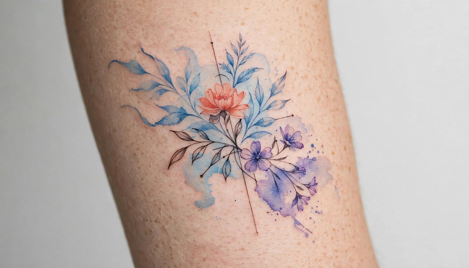
Larger designs, richer pigment, selective linework, limited sun exposure, and careful healing can improve how the artwork ages. Still, you should choose a watercolor tattoo as a living piece of art, not a design expected to look exactly the same forever.
A Simple Healing Routine That Protects the Artwork
Follow your artist’s instructions first because bandage types, ointments, and healing methods can vary. In general, treat fresh ink as an open wound until the skin barrier closes, which often takes about two to four weeks.
- Wash your hands before touching the tattoo. Remove the bandage as directed by your artist, then gently wash the area with lukewarm water and mild, fragrance-free soap.
- Pat the skin dry with a clean paper towel. Avoid rubbing because friction can irritate the area and disturb peeling skin.
- Apply a thin layer of suitable moisturizer. Too much product can trap moisture and prevent the skin from breathing, so use only enough to reduce dryness.
- Leave flakes and scabs alone. Picking or scratching can remove pigment, cause irritation, and increase the risk of scarring.
- Reduce friction while the tattoo heals. Wear loose, breathable clothing, especially over tattoos on the ribs, sternum, thigh, or lower back. These lower back tattoo designs also show why clothing and movement matter when choosing placement.
- Avoid swimming, hot tubs, baths, and prolonged soaking. Showers are generally safer, but don’t submerge the tattoo until the skin has fully healed.
Keep direct sunlight away from fresh ink with shade or loose clothing. Don’t apply sunscreen while the tattoo is open, peeling, or scabbed. After healing, use broad-spectrum, water-resistant SPF 30 or higher, and follow the American Academy of Dermatology’s tattoo care guidance for ongoing protection.
Choose a licensed or reputable studio that uses sterile practices, and disclose allergies or skin conditions before your appointment. Increasing pain, spreading redness, warmth, pus, foul-smelling drainage, red streaks, fever, or chills require prompt medical attention rather than routine aftercare.
Conclusion
The best watercolor tattoo starts with a design that carries personal meaning and fits your preferred style. Give detailed artwork enough space to remain readable, and use contrast or subtle linework when the composition needs more structure. A thoughtful placement also matters, especially in areas exposed to frequent sunlight or friction.
Before booking, choose an artist who understands watercolor technique and can show healed examples of similar work. Reviewing watercolor wolf tattoo ideas can also help you compare expressive color, fine linework, and placement before finalizing your concept.
Watercolor tattoos are beautiful because of their soft, painted quality. Careful planning and consistent aftercare help preserve that character, so choose an idea that fits your life as well as your personal taste.
Save the pin for later


- 60 Color Tattoos That Healed Beautifully - 25/09/2026
- 40 Most Painful Tattoo Spots - 24/09/2026
- 20 Tattoo Aftercare Mistakes That Ruin Fresh Ink - 23/09/2026

